Figure.1
| PolarSPARC |
Machine Learning - Data Preparation - Part 1
| Bhaskar S | 05/15/2022 |
Overview
Data Preparation is a critical and time-consuming first phase in any Data Science project. This phase typically takes almost 80% of the total project time. In this article, we are using the term Data Preparation to cover the following tasks:
Data Domain Knowledge - This task involves acquiring the data domain knowledege and having a good understanding about the various features (data attributes)
Exploratory Data Analysis - EDA for short, this task involves loading the raw data set for the data domain, performing initial analysis to gather insights from the loaded data set, understanding the various features and their types (discrete, continuous, categorical), identifying features with missing values, infering statistical information about the features (summary statistics, outliers, distibution), infering the relationships between the features, etc
Feature Engineering - This task involves using the information gathered from the EDA phase to encode the values of some of the categorical features to numerical, address missing values for some of the features, normalizing and scaling the feature values, adding additional features (derived features), etc
Note that the tasks 2 and 3 from the above cycle through iteratively until we arrive at a cleansed data set that can be used in the data science project.
Data Domain Knowledge
In this article, we will use the City of Ames, Iowa Housing Prices data set to perform the various tasks involved in the data preparation. This data set has a good number of features with a mix of both categorical and numerical data types as well as some features missing values.
The following are the list of all the features (with their description) from the data set:
The features are pretty self-explanatory and easy to understand.
Exploratory Data Analysis
The first step is to import all the necessary Python modules such as, matplotlib, pandas, seaborn, and scikit-learn as shown below:
import pandas as pd
import matplotlib.pyplot as plt
import seaborn as sns
from sklearn.model_selection import train_test_split
The next step is to load the housing price dataset into a pandas dataframe as shown below:
url = './data/ames.csv'
ames_df = pd.read_csv(url)
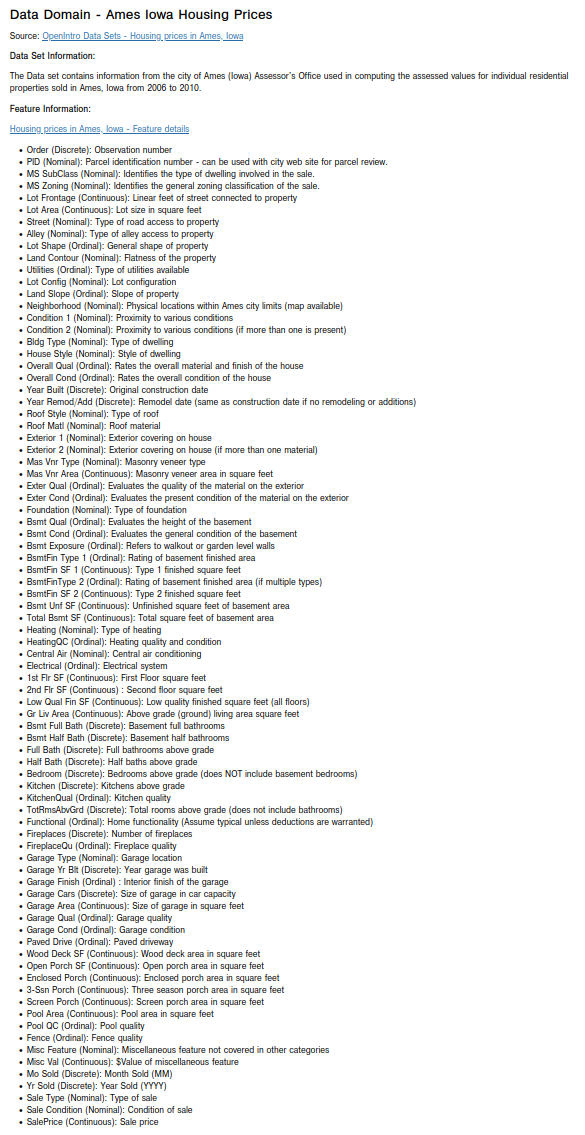
The next step is to display the first few samples from the housing price dataset as shown below:
ahp_df.head(10)
The following illustration shows a section of columns of the first 10 rows of the housing price dataset:
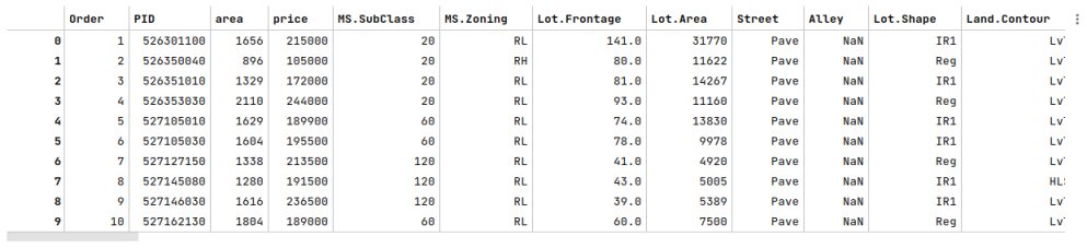
The next step is to display the shape (rows and columns) of the housing price dataset as shown below:
ames_df.shape
The following illustration shows the shape of the housing price dataset:
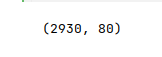
The next step is to display information about the housing price dataframe, such as index and column types, missing (null) values, memory usage, etc., as shown below:
ames_df.info()
The following illustration displays the information about the housing price dataframe:
Notice that some features (annotated in red) have significantly large number of missing values.
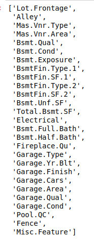
The next step is to display the feature names from the housing price dataframe that have missing (nan) values as shown below:
features_na = [feature for feature in ames_df.columns if ames_df[feature].isnull().sum() > 0]
features_na
The following illustration displays the list of all the feature names from the housing price dataframe with missing values:
The next step is to display the features and by what fraction they are missing values (in the descending order) from the housing price dataframe as shown below:
ames_df[features_na].isnull().mean().sort_values()
The following illustration displays the list of the feature names along with what fraction of values are missing (in the descending order) from the housing price dataframe:
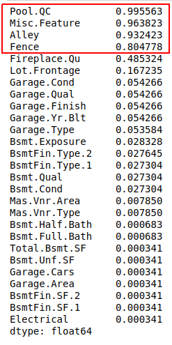
Notice that some features (annotated in red) have significantly large fraction of missing values.
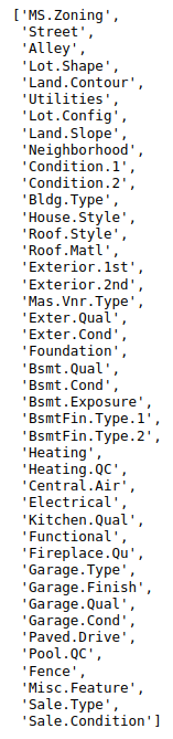
The next step is to display the names of the categorical features from the housing price dataframe as shown below:
ames_df.select_dtypes(include=['object']).columns.tolist()
The following illustration displays the list of all the categorical features from the housing price dataframe:
The next step is to split the housing price dataset into two parts - a training data set and a test data set. The training data set is used to train the model and the test data set is used to evaluate the model. In this use case, we split 75% of the samples into the training data set and remaining 25% into the test data set as shown below:
X_train, X_test, y_train, y_test = train_test_split(ames_df, ames_df['SalePrice'], test_size=0.25, random_state=101)
The next step is to display the correlation between the numerical features and the target feature (SalePrice) for the housing price training data set as shown below:
plt.figure(figsize=(24, 16))
sns.heatmap(X_train.corr(), annot=True, annot_kws={'size': 12}, cmap='coolwarm', fmt='0.2f', linewidth=0.1)
plt.show()
The following illustration displays the correlation between the numerical features and the target (SalePrice) for the housing price training data set:
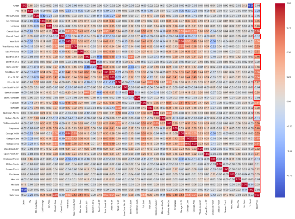
Notice that some features (annotated in red) have no strong correlation (lesser than 50%) with the target (SalePrice).
The next step is to display the features by their correlation values to the target (SalePrice) (in the descending order) from the housing price training data set as shown below:
X_train.corr()['SalePrice'].sort_values(ascending=False)
The following illustration displays the features by their correlation coefficient to the target (SalePrice) (in the descending order) from the housing price training data set:
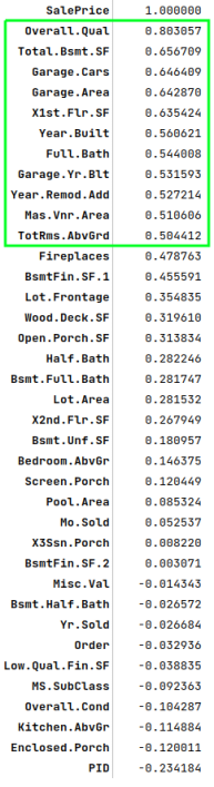
Notice that some features (annotated in green) have a strong correlation (greater than 50%) with the target (SalePrice).
It is now time to gather insights about some of the features through visual plots using the housing price training data set. Let us examine the first few numerical features that are strongly correlated with the target (SalePrice).
The next step is to display a line plot between the numerical feature Overall.Qual (overall quality and finish) and the target SalePrice using the housing price training data set as shown below:
plt.figure(figsize=(8, 7))
sns.lineplot(x='Overall.Qual', y='SalePrice', color='teal', data=X_train)
plt.show()
The following illustration shows the line plot between the numerical feature Overall.Qual and the target SalePrice using the housing price training data set:
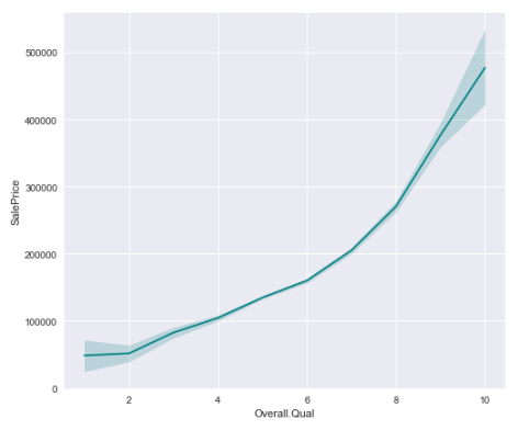
Notice that as the value of the feature Overall.Qual increases, so does the value of the SalePrice.
The next step is to display the scatter plot (with distribution) between the numerical feature Total.Bsmt.SF (total basement area in square feet) and the target SalePrice using the housing price training data set as shown below:
sns.jointplot(x='Total.Bsmt.SF', y='SalePrice', kind='reg', height=8, joint_kws={'color':'tan', 'line_kws':{'color':'gray'}}, data=X_train)
plt.show()
The following illustration shows the scatter plot (with distribution) between the numerical feature Total.Bsmt.SF and the target SalePrice using the housing price training data set:
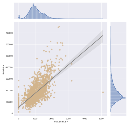
Notice that as the value of the feature Total.Bsmt.SF increases, so does the value of the SalePrice. However, the increase in SalePrice seems to happen for Total.Bsmt.SF upto 3000 sqft.
The next step is to display a bar plot of the unique categorical values of the feature MS.Zoning (zoning classification) using the housing price training data set as shown below:
plt.figure(figsize=(8, 7))
ax = sns.countplot(x='MS.Zoning', data=X_train)
ax.bar_label(ax.containers[0])
plt.show()
The following illustration shows the bar plot of the unique categorical values of the feature MS.Zoning using the housing price training data set:
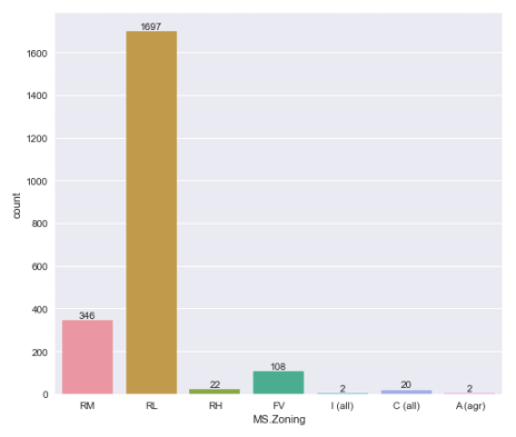
Notice that as the value of RL (residential low density) zoning is the highest, which makes total sense.
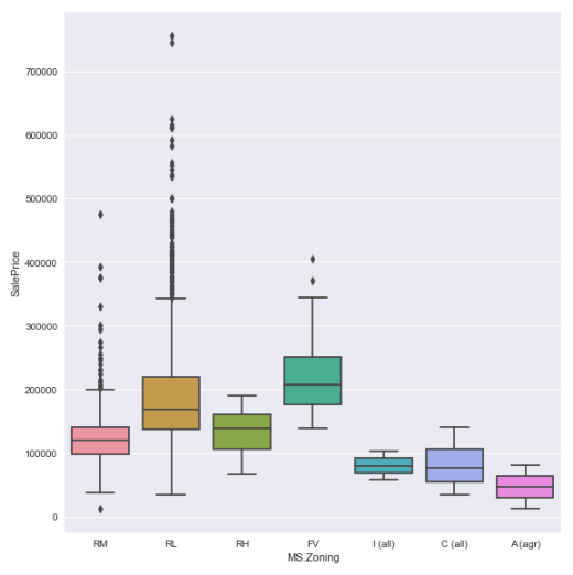
The next step is to display the box plot between the categorical feature MS.Zoning and the target SalePrice using the housing price training data set as shown below:
sns.catplot(x='MS.Zoning', y='SalePrice', kind='box', height=8.0, data=X_train)
plt.show()
The following illustration shows the box plot between the categorical feature MS.Zoning and the target SalePrice using the housing price training data set:
Hands-on Demo
The following is the link to the Jupyter Notebooks that provides an hands-on demo for this article: