Figure.23
| PolarSPARC |
Introduction to Matplotlib - Part 3
| Bhaskar S | 10/01/2017 |
Hands-on Matplotlib
Pie Chart
We now switch gears to explore some pie charts in Matplotlib.
For this example, we generate a random sample of 100 scores in the range 1 to 100, map the scores to a letter grade (A, B, C, D, F), determine the distribute of grades (count of each grade), and finally display a pie chart of the grade distribution.
Let us initialize the random number generator by invoking seed() method (for reproducibility) as shown below:
np.random.seed(50)
Now, we generate a random sample of 100 scores in the range 1 through 100 (with replacement) by invoking the choice() method as shown below:
scores = np.random.choice(range(1, 101), 100, replace=True)
Next, we map the sample scores to letter grades using the following method:
def score_to_grade(n):
  if n > 90:
      return 'A'
  elif n > 80 and n <= 90:
      return 'B'
  elif n > 70 and n <= 80:
      return 'C'
  elif n > 60 and n <= 70:
      return 'D'
  return 'F'

letter_grades = map(score_to_grade, list(scores))
Finally, we will map the letter grades to distribution of grades using the following method:
from collections import defaultdict

dist_counts = defaultdict(int)

def get_grade_counts(s):
    if s == 'A':
        dist_counts['A'] += 1
    elif s == 'B':
        dist_counts['B'] += 1
    elif s == 'C':
        dist_counts['C'] += 1
    elif s == 'D':
        dist_counts['D'] += 1
    else:
        dist_counts['F'] += 1

map(get_grade_counts, letter_grades)

keys = sorted(dist_counts.keys())
values = [dist_counts[k] for k in keys]
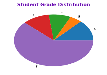
To display a pie chart, use the pie() method as shown below:
plt.pie(values, labels=keys)
plt.title('Student Grade Distribution', color='#6b0eb2', fontsize='16', fontweight='bold')
plt.show()
The plot should look similar to the one shown in Figure.23 below:
The pie() method generates a simple elliptical pie chart. It is called with two parameters, both of which are a collection (of the same size). The first parameter represents the count of each grade from the sample and will be displayed as a segment (wedge) in the pie chart, while the second parameter represents the grade letters and will be used to show the segment labels.
By default, a pie chart is displayed as an ellipse with the data displayed in a counter-clockwise way.
To display the distribution of grades in a clockwise fashion, with percentages in each segment, and emphasize the segment for grade A, execute the following methods as shown below:
explode = [0.1, 0.0, 0.0, 0.0, 0.0]
plt.pie(values, labels=keys, explode=explode, autopct='%1.1f%%', counterclock=False)
plt.title('Student Grade Distribution', color='#6b0eb2', fontsize='16', fontweight='bold')
plt.show()
The plot should look similar to the one shown in Figure.24 below:
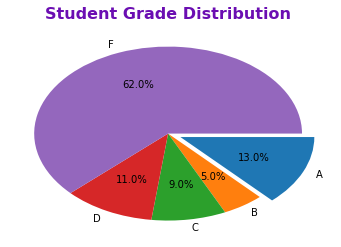
To display the grade segments in a clockwise fashion, set the counterclock parameter to False.
To display percentage values for each segment, use the autopct parameter to specify a format string for the percentages.
To emphasize the segment for grade A, use the explode parameter to specify a collection of decimal fractions. A value other than 0.0 in the collection will help emphasize the corresponding segment. Since grade A is in the first position, we use the value of 0.1 in the first position of the specified collection to emphasize grade A.
To display a slightly bigger circular pie chart, execute the following methods as shown below:
explode = [0.1, 0.0, 0.0, 0.0, 0.0]
plt.axis('equal')
plt.pie(values, labels=keys, explode=explode, autopct='%1.1f%%', counterclock=False, radius=1.2)
plt.title('Student Grade Distribution', color='#6b0eb2', fontsize='16', fontweight='bold')
plt.show()
The plot should look similar to the one shown in Figure.25 below:
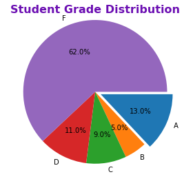
The axis() method with a parameter value of equal is what allows us to generate a circular pie chart.
To display a slightly larger circle, use the radius parameter to control the radius of the circle.
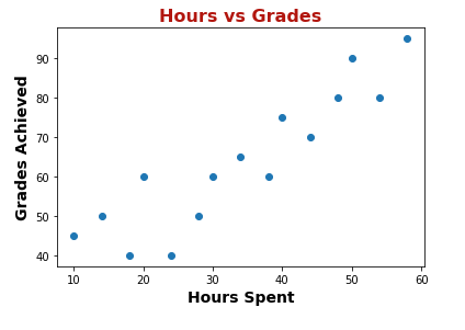
Scatter Plot
Next, shifting gears, let us explore some scatter plots in Matplotlib.
A scatter plot is used to depict the relationship between two variables.
In this hypothetical example, we try to depict the relationship between the hours spent studying and the grades scored.
We create two lists of 15 data points each - one representing hours spent and the other representing grades scored as shown below:
hours = np.array([10, 14, 18, 20, 24, 28, 30, 34, 38, 40, 44, 48, 50, 54, 58])
grades = np.array([45, 50, 40, 60, 40, 50, 60, 65, 60, 75, 70, 80, 90, 80, 95])
To display a scatter plot between the sample hours and grades, use the scatter() method as shown below:
plt.scatter(hours, grades)
plt.title('Hours vs Grades', color='#b2160e', fontsize='16', fontweight='bold')
plt.xlabel('Hours Spent', fontsize='14', fontweight='bold')
plt.ylabel('Grades Achieved', fontsize='14', fontweight='bold')
plt.show()
The plot should look similar to the one shown in Figure.26 below:
To cutomize the scatter plot to use a hollow red circle, use the scatter() method as shown below:
plt.scatter(hours, grades, facecolors='none', color='r', s=70)
plt.title('Hours vs Grades', color='#b2160e', fontsize='16', fontweight='bold')
plt.xlabel('Hours Spent', fontsize='14', fontweight='bold')
plt.ylabel('Grades Achieved', fontsize='14', fontweight='bold')
plt.xticks(range(10, 70, 10))
plt.yticks(range(30, 100, 5))
plt.show()
The plot should look similar to the one shown in Figure.27 below:
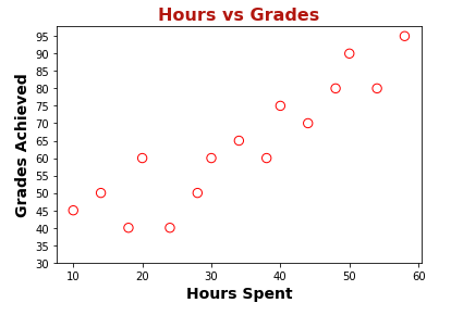
Seeting the parameter facecolors to none allows one to not fill the marker color, creating a hollow effect.
The parameter s controls the size of the marker.
Sub Plots
Now, for the last topic on rendering multiple plots (in a grid) in Matplotlib.
Often times, we need multiple plots to be displayed side-by-side to better understand data. For example, in our trivial case, we may desired to see a box plot of the sample scores next to a histogram of the sample scores to better understand the random data at hand. This is where the sub plots come in handy.
Sub plots are nothing more than a 2-dimensional grid arrangement of rows and columns, where each plot is rendered in a (row, column) location.
To display a box plot and a histogram side-by-side horizontally in a (1 x 2) grid using the sample scores, execute the folowing methods as shown below:
fig = plt.figure()
sp1 = fig.add_subplot(1, 2, 1)
sp1.boxplot(scores, patch_artist=True, capprops=dict(color='r', linewidth=2), boxprops=dict(facecolor='y', color='k', linewidth=2), medianprops=dict(color='r', linewidth=2), whiskerprops=dict(color='k', linewidth=2))
sp1.set_xticks([])
sp2 = fig.add_subplot(1, 2, 2)
sp2.hist(scores, bins=20, facecolor='y', edgecolor='k')
sp2.set_xticks(range(10, 110, 10))
plt.show()
The plot should look similar to the one shown in Figure.28 below:
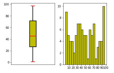
The figure() method creates a blank figure object.
The add_subplot() method is invoked on the fig object to add a sub plot to the figure. The first parameter indicates number of rows, the second parameter indicates number of columns, the last parameter indicates the plot number. In the example above, add_subplot(1, 2, 1) indicates that this is plot number 1 (last parameter with value 1) in a figure with two sub plots (second parameter with value 2 for 2 columns) that are laid horizontally (first parameter with value 1 for 1 row).
The add_subplot() method returns a handle for drawing a plot and that is what is used to render the box plot or histogram.
References