Figure.1
| PolarSPARC |
Machine Learning - Support Vector Machines using Scikit-Learn
| Bhaskar S | 08/10/2022 |
Overview
Support Vector Machines (or SVM for short) is another machine learning model that is widely used for classification problems, although it can also be used for regression problems.
Support Vector Machines
Before we jump into the intuition behind SVM, let us understand the concept of Hyperplanes in the context of the Geometrical space.
A Hyperplane is a $N-1$ subspace in an $N$ dimensional geometric space. For example, a DOT is a subspace on a one dimensional LINE, a LINE is a subspace on a two dimensional PLANE, a PLANE is a subspace on a three dimensional geometric space, and so on. For the $4^{th}$ dimension and beyond, since it is difficult to visuialize, we refer to the subspace as a HYPERPLANE.
In the context of SVM, a Hyperplane separates the target class(es) based on the given features.
In the following sections, we will develop an intuition on the working of the SVM classification model.
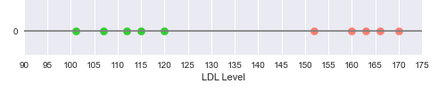
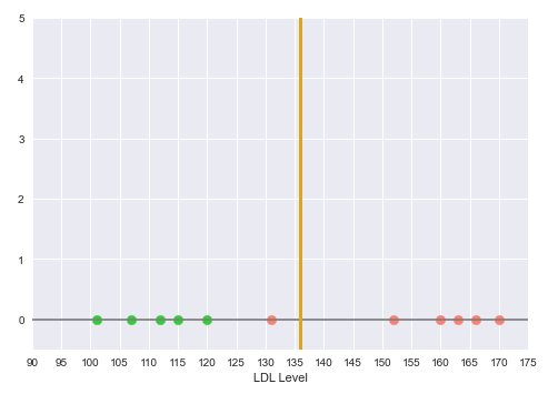
Consider that we have a simple data set with one feature the cholesterol LDL levels and the outcome of whether someone has a Heart disease.
The following illustration shows the plot of the LDL levels on a one-dimensional line, with the green points indicating no heart disease and the red points indicating heart disease:
From the illustration in Figure.1 above, we can see a clear separation between the two classes - Disease and No Disease.
The question then is, where on the line, we can put the Decision Boundary to segregate the classes ???
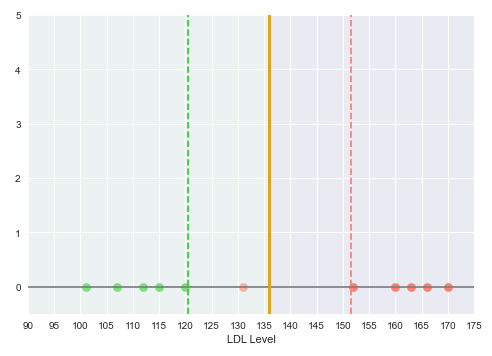
Intuitively, looking at the illustration in the Figure.1 above, the decision boundary should be mid-way between the region separating the green points from the red points. The space between the decision boundary and the class point (green or red) farthest from the decision boundary is referred to as the Margin.
The following illustration shows the decision boundary hyperplane (golden line) between the green dotted margin line (that separates the green points) and the red dotted margin line (that separates the red points):
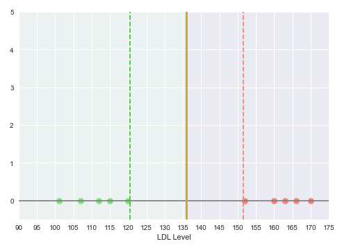
With this decision boundary in place, any new data points with LDL level below 135 is classfied as 'No Heart Disease' and anything above 135 is classified as having 'Heart Disease'.
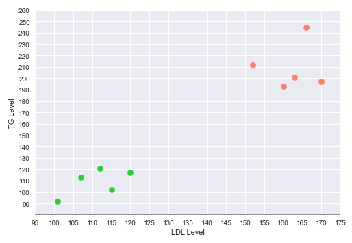
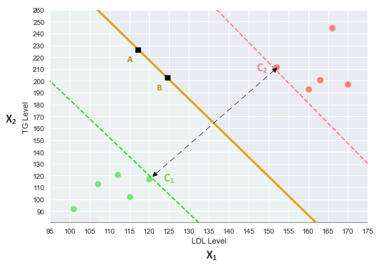
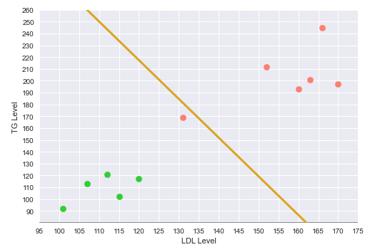
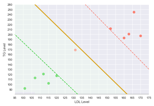
Now, consider the same simple data set with two features - the cholesterol LDL and Triglyceride (TG) levels and the outcome of whether someone has a Heart disease.
The following illustration shows the plot of the LDL vs TG levels on a two-dimensional plot, with the green points indicating no heart disease and the red point indicating heart disease:
The following illustration shows the decision boundary hyperplane (golden line) between the green dotted margin line (that separates the green points) and the red dotted margin line (that separates the red points) in the two-dimensional space:
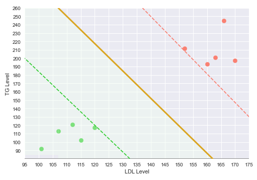
The dotted margin lines (green and red), that correspond to the two classes, touch the appropriate class vectors (the data points) that are farthest from the decision boundary. Those vectors (touching the class margin lines) are referred to as the Support Vectors.
With this decision boundary in place, any new data points that fall below the decision boundary (green region) classfied as 'No Heart Disease' and anything above the decision boundary is classified as having 'Heart Disease'.
The classifier in the above two cases (one and two dimensional) is referred to as the Maximal Margin Classifier. In other words, we want a decision boundary that maximizes the margins between the classes.
Now that we have a geometrical intuition on the Maximal Margin Classifier, let us look at it from a mathematical point of view.
We will refer to the following illustration for the mathematical intuition:
The equation for a line in a two dimensional space is: $y = m.x + c$, where $m$ is the slope and $c$ is the y-intercept.
For the two features $x_1$ (x-axis) and $x_2$ (y-axis), the equation of the decision boundary (line) is: $x_2 = \beta_1.x_1 + \beta_0$
That is, $\beta_1.x_1 - x_2 + \beta_0 = 0$
Or, $\begin{bmatrix} \beta_1 & -1\end{bmatrix}$.$\begin{bmatrix} x_1 \\ x_2\end{bmatrix} + \beta_0 = 0$
Or, $\beta^T.X + \beta_0 = 0$ ..... $\color{red} (1)$
Consider the two points $A$ and $B$ on the decision boundary line.
Then, using the equation (1) from above, we get the following:
$\beta^T.A + \beta_0 = 0$ ..... $\color{red} (2)$
$\beta^T.B + \beta_0 = 0$ ..... $\color{red} (3)$
Subtracting (2) from (3), we get the following:
$\beta^T.A + \beta_0 - \beta^T.B - \beta_0 = \beta^T.(A - B) = 0$ ..... $\color{red} (4)$
From the equation (4) above, we know $\beta^T$ and $(A - B)$ are both vectors in the two dimensional space and from Linear Algebra (Part 1), we know if the dot product of two vectors is ZERO, then they have to be ORTHOGONAL. That is, the vector $\beta^T$ is orthogonal (or perpendicular) to the vector $(A - B)$.
For any new points BELOW the decision boundary line (represented using $-1$), we classify them as 'no heart disease' (green points). Then, the corresponding equation would be as follows:
$\beta^T.X + \beta_0 \le -1$ ..... $\color{red} (5)$
For any new points ABOVE the decision boundary line (represented using $1$), we classify them as 'heart disease' (red points). Then, the corresponding equation would be as follows:
$\beta^T.X + \beta_0 \ge 1$ ..... $\color{red} (6)$
In other words, the target $y$ prediction is a $-1$ (green point - no heart disease) OR $1$ (red point - heart disease).
This implies, equations $\color{red}(5)$ and $\color{red}(6)$ can be expressed using the following compact form:
$\bbox[pink,2pt]{y.(\beta^T.X + \beta_0) \ge 1}$ ..... $\color{red} (7)$
Let $C_1$ be the nearest green point to the decision boundary. Then, using equation (5), we get: $\beta^T.C_1 + \beta_0 = -1$ ..... $\color{red} (8)$
Similarly, let $C_2$ be the nearest red point to the decision boundary. Then, using equation (6), we get: $\beta^T.C_2 + \beta_0 = 1$ ..... $\color{red} (9)$
Subtracting (9) from (8), we get the following:
$\beta^T.C_2 + \beta_0 - \beta^T.C_1 - \beta_0 = 1 - (-1)$
That is, $\beta^T.(C_2 - C_1) = 2$
To eliminate $\beta^T$ from the left-hand side, we make it a unit vector.
That is, $\Large{\frac{\beta^T}{\lVert \beta^T \rVert}}$.$(C_2 - C_1) = \Large{\frac{2}{\lVert \beta^T \rVert}}$
Given $\Large{\frac{\beta^T}{\lVert \beta^T \rVert}}$ is a unit vector of magnitude $1$, we can drop it from the left-hand side.
That is, $(C_2 - C_1) = \Large{\frac{2}{\lVert \beta^T \rVert}}$ ..... $\color{red} (10)$
The goal of Maximal Margin Classifier is to maximize the equation $\color{red}(10)$ from above.
Conversely, the goal can also be to minimize $\Large{\frac{\lVert \beta^T \rVert}{2}}$ ..... $\color{red} (11)$
Note that maximization of equation $\color{red}(10)$ (or minimization of equation $\color{red}(11)$) is bounded by the constraints of equation $\color{red}(7)$.
Now that we have a mathematical intuition, let us add a little twist. What if we encounter an outlier data point (with heart disease) as depicted in the following illustration:
The Maximal Margin Classifier (with its hard margins) would classify the outlier as 'No Heart Disease', which is not true.
The following illustration shows the same outlier point in the two-dimensional space:
What if we have classifier with SOFT margins that allows for some misclassifications ??? That is exactly what the Support Vector Classifier is for.
The following illustration shows the visual representation of the Support Vector Classifier with the misclassified outlier:
The following illustration shows the visual representation of the Support Vector Classifier with a misclassified outlier in the two-dimensional space:
Now, consider another simple data set with one feature - the number of credit cards and the outcome of whether someone has a good credit score or not. If someone has less than $3$ or greater than $6$ credit cards, they have a bad credit score.
The following illustration shows the plot of the number of credit cards on a one-dimensional line, with the green points indicating good credit score and the red points indicating bad credit score:
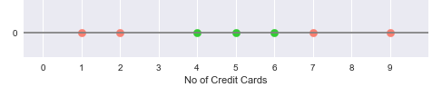
From the illustration in Figure.8 above, it is obvious that there is no easy way to classify the data points into good and bad credit scores.
How do we classify the data points in this situations ???
Before we proceed to tackle this situation, let us understand the concept of Kernels.
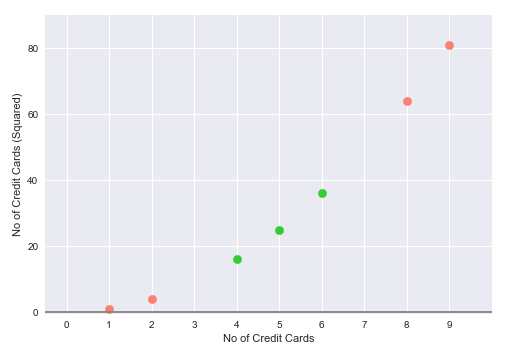
A Kernel is a type of transformation that projects the features of a data set into a higher dimension. One of the commonly used kernels is a Polynomial Kernel. For example, given a feature $X_i$, a second degree Polynomial Kernel could be $X_i^2$.
For situations (as in the Figure.8 above) where there is no easy way to classify the data points, such a task falls in the realm of the Support Vectore Machines, which makes use of a kernel to transform the features into a higher dimension.
For our usecase, we will use a $2^{nd}$ degree Polynomial Kernel to square the number of credit cards and use it as the second feature. In other words we are moving a one-dimensional space (line) to a two-dimensional space (plane).
The following illustration depicts the visual representation of the Support Vector Machine, which uses the $2^{nd}$ degree Polynomial Kernel, to project the single feature into the two-dimensional space:
Now, we are in a much better position to segregate the two classes and the following illustration shows the hyperplane (golden line) between the green points and the red points in the two-dimensional space:
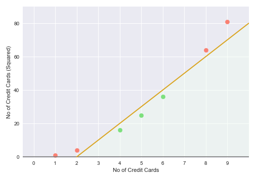
This in essence is the idea behind the Support Vector Machine model, that is, to find a higher dimension to separate the data samples into the different target classes.
Hands-on Demo
For the hands-on demonstration of the SVM classification model, we will predict the event of death due to heart failure, using the dataset that contains the medical records of some heart patients.
The first step is to import all the necessary Python modules such as, matplotlib, pandas, and scikit-learn as shown below:
import numpy as np
import pandas as pd
import matplotlib.pyplot as plt
from sklearn.preprocessing import StandardScaler
from sklearn.model_selection import train_test_split
from sklearn.svm import SVC
from sklearn.metrics import accuracy_score
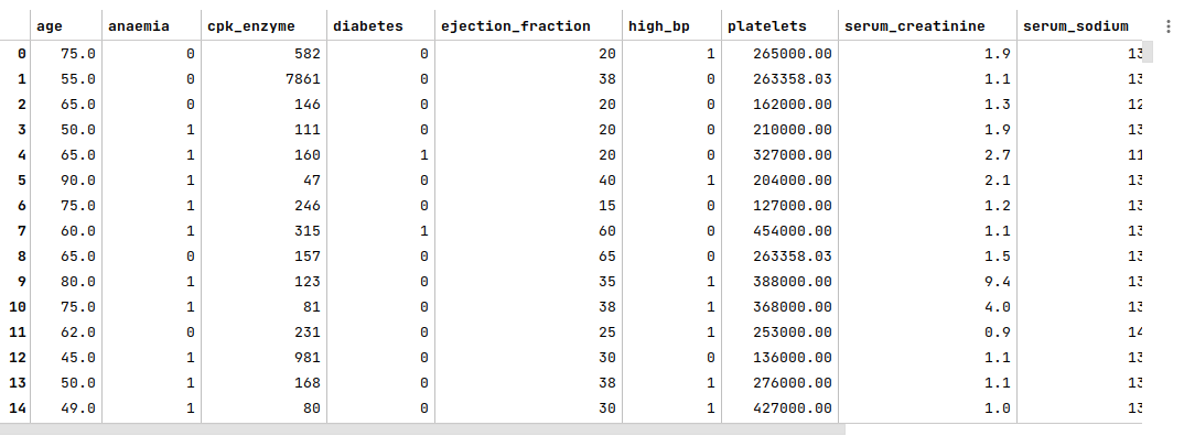
The next step is to load the heart failure dataset into a pandas dataframe, adjust some column names, and display the dataframe as shown below:
url = 'https://archive.ics.uci.edu/ml/machine-learning-databases/00519/heart_failure_clinical_records_dataset.csv'
heart_failure_df = pd.read_csv(url)
heart_failure_df.rename(columns={'DEATH_EVENT': 'death_event', 'creatinine_phosphokinase': 'cpk_enzyme', 'high_blood_pressure': 'high_bp'}, inplace=True)
heart_failure_df
The following illustration displays few rows/columns from the heart failure dataframe:
The next step is to split the heart failure dataframe into two parts - a training data set and a test data set. The training data set is used to train the SVM model and the test data set is used to evaluate the SVM model. In this use case, we split 75% of the samples into the training dataset and remaining 25% into the test dataset as shown below:
X_train, X_test, y_train, y_test = train_test_split(heart_failure_df, heart_failure_df['death_event'], test_size=0.25, random_state=101)
X_train = X_train.drop('death_event', axis=1)
X_test = X_test.drop('death_event', axis=1)
The next step is to create an instance of the standardization scaler to scale the desired feature (or predictor) variables in both the training and test dataset as shown below:
scaler = StandardScaler()
s_X_train = pd.DataFrame(scaler.fit_transform(X_train), columns=X_train.columns, index=X_train.index)
s_X_test = pd.DataFrame(scaler.fit_transform(X_test), columns=X_test.columns, index=X_test.index)
The next step is to initialize the SVM classification model class from scikit-learn and train the model using the scaled training data set as shown below:
model = SVC(kernel='linear', C=100, random_state=101)
model.fit(s_X_train, y_train)
The following are a brief description of some of the hyperparameters used by the SVM classification model:
kernel - the SVM kernel transformation to use. The commonly used options are linear and poly (for polynomial)
C - the regularization parameter that is inversely proportional to the number of misclassifications allowed by the SVM model. The lower the value, the higher the misclassifications. The higher the value, the lower the misclassifications
The next step is to use the trained model to predict the death_event using the scaled test dataset as shown below:
y_predict = model.predict(s_X_test)
The next step is to display the accuracy score for the model performance as shown below:
accuracy_score(y_test, y_predict)
The following illustration displays the accuracy score for the model performance:
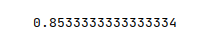
From the above, one can infer that the model seems to predict with good accuracy.
Hands-on Demo
The following is the link to the Jupyter Notebook that provides an hands-on demo for this article: