Figure.1
| PolarSPARC |
Machine Learning - Logistic Regression using Scikit-Learn - Part 2
| Bhaskar S | 05/06/2022 |
Overview
In Part 1 of this series, we derived the mathematical intuition behind a Logistic Regression model that is used for classification tasks.
In this article, we will demonstrate the use of the Logistic Regression model in scikit-learn by leveraging the Heart Failure clinical records dataset.
Logistic Regression
For the hands-on demonstration of the logistic regression model, we will predict the event of death due to heart failure, using the dataset that contains the medical records of some heart patients.
The first step is to import all the necessary Python modules such as, matplotlib, pandas, and scikit-learn as shown below:
import numpy as np
import pandas as pd
import matplotlib.pyplot as plt
import seaborn as sns
from sklearn.preprocessing import StandardScaler
from sklearn.model_selection import train_test_split
from sklearn.linear_model import LogisticRegression
from sklearn.metrics import accuracy_score, precision_score, recall_score, confusion_matrix, RocCurveDisplay
The next step is to load the heart failure dataset into a pandas dataframe and adjust some column names as shown below:
url = 'https://archive.ics.uci.edu/ml/machine-learning-databases/00519/heart_failure_clinical_records_dataset.csv'
heart_failure_df = pd.read_csv(url)
heart_failure_df.rename(columns={'DEATH_EVENT': 'death_event', 'creatinine_phosphokinase': 'cpk_enzyme', 'high_blood_pressure': 'high_bp'}, inplace=True)
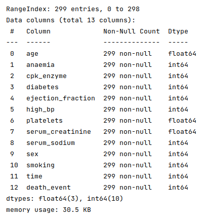
The next step is to display information about the heart failure dataframe, such as index and column types, missing (null) values, memory usage, etc., as shown below:
heart_failure_df.info()
The following illustration displays information about the heart failure dataframe:
Fortunately, the data seems clean with no missing values.
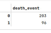
The next step is to display the information about the number of non-death events vs death events as shown below:
heart_failure_df['death_event'].value_counts()
The following illustration displays the counts of the non-death events vs the death events:
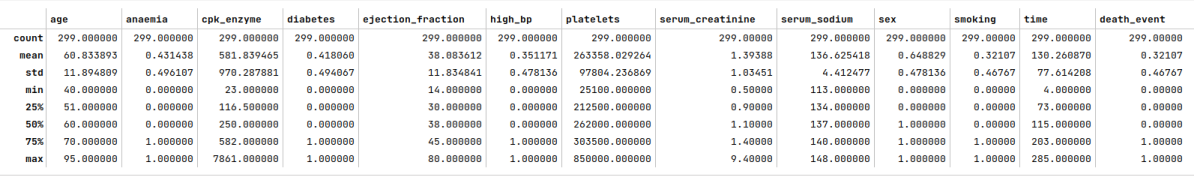
The next step is to display the summary statistics on the various columns of the heart failure dataframe as shown below:
auto_df.describe()
The following illustration displays the summary statistics on the various columns of the heart failure dataframe:
The next step is to split the heart failure dataset into two parts - a training dataset and a test dataset. The training dataset is used to train the classification model and the test dataset is used to evaluate the classification model. In this use case, we split 75% of the samples into the training dataset and remaining 25% into the test dataset as shown below:
X_train, X_test, y_train, y_test = train_test_split(heart_failure_df, heart_failure_df['death_event'], test_size=0.25, random_state=101)
The next step is to display the correlation matrix of the feature (or predictor) variables with the target variable as shown below:
sns.heatmap(X_train.corr(), annot=True, cmap='coolwarm', fmt='0.2f', linewidth=0.5)
plt.show()
The following illustration displays the correlation matrix of the feature from the heart failure dataframe:
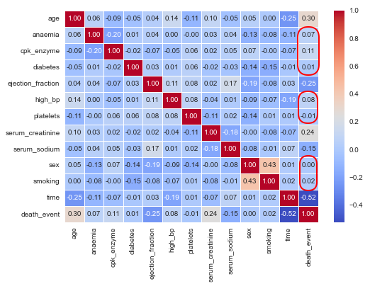
One can infer from the correlation matrix above that some of the features (annotated in red) do not have a strong relation with the target variable.
The next step is to drop the features with no or low correlation with the target variable from the training and test dataset as shown below:
X_train_f = X_train.drop(['death_event', 'anaemia', 'cpk_enzyme', 'diabetes', 'high_bp', 'platelets', 'sex', 'smoking'], axis=1)
X_test_f = X_test.drop(['death_event', 'anaemia', 'cpk_enzyme', 'diabetes', 'high_bp', 'platelets', 'sex', 'smoking'], axis=1)
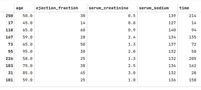
The next step is to display the first few samples from the heart failure training dataset as shown below:
X_train_f.head(10)
The following illustration shows the first 10 rows of the heart failure dataset:
The next few steps is to visualize relationships between a feature and the target (death_event), so that we can gain some useful insights.
The next step is to display a box plot that shows the relationship between the death_event and age using the heart failure training dataset as shown below:
sns.boxplot(x='death_event', y='age', data=X_train)
plt.show()
The following illustration shows the box plot between death_event and age from the heart failure training dataset:
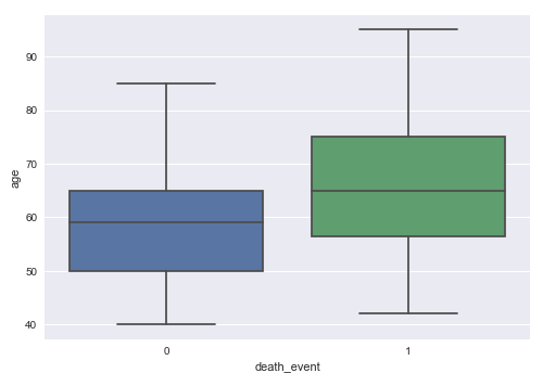
From the box plot above, we can infer that death from heart failure seems to occur more in older patients.
The next step is to display a box plot that shows the relationship between the death_event and ejection_fraction (which is the amount of blood pumped from the heart) using the heart failure training dataset as shown below:
sns.boxplot(x='death_event', y='ejection_fraction', data=X_train)
plt.show()
The following illustration shows the box plot between death_event and ejection_fraction from the heart failure training dataset:
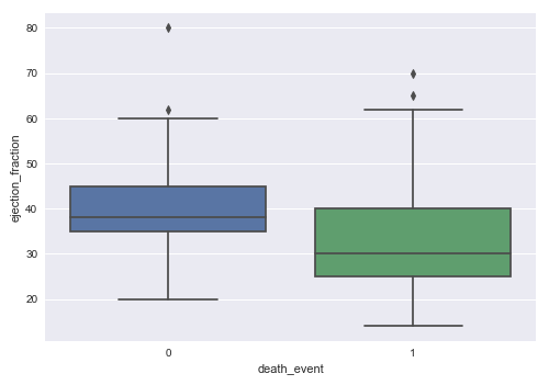
From the box plot above, we can infer that death from heart failure seems to occur more in patients with lower ejection fraction.
We will explore one final box plot. So, the next step is display a box plot that shows the relationship between the death_event and serum_creatinine (which is the amount of waste in blood from the kidney) using the heart failure training dataset as shown below:
sns.boxplot(x='death_event', y='serum_creatinine', data=X_train)
plt.show()
The following illustration shows the box plot between death_event and serum_creatinine from the heart failure training dataset:
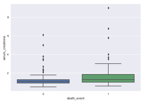
From the box plot above, we can infer that death from heart failure seems to occur more in patients with higher levels of serum creatinine.
The next step is to create an instance of the standardization scaler to scale the desired feature (or predictor) variables in both the training and test dataset as shown below:
scaler = StandardScaler()
s_X_train_f = pd.DataFrame(scaler.fit_transform(X_train_f), columns=X_train_f.columns, index=X_train_f.index)
s_X_test_f = pd.DataFrame(scaler.fit_transform(X_test_f), columns=X_test_f.columns, index=X_test_f.index)
The next step is to initialize the classification model class from scikit-learn. For our demonstration, we will initialize a logistic regression model as shown below:
model = LogisticRegression(max_iter=5000)
Notice the use of the hyperparameter max_iter to control the maximum number of iterations to arrive at the optimal values of the $\beta$ coefficients for the corresponding feature variables.
The next step is to train the model using the training dataset as shown below:
model.fit(s_X_train_f, y_train)
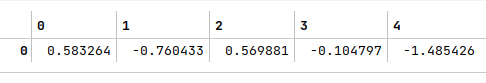
The next step is to display the values for the intercept and the coefficient (the slope) as shown below:
model.coef_
The following illustration displays the values for the $\beta$ coefficients from the model:
The next step is to use the trained model to predict the death_event using the test dataset as shown below:
y_predict = model.predict(s_X_test_f)
The next step is to display the accuracy score for the model performance as shown below:
accuracy_score(y_test, y_predict)
The following illustration displays the accuracy score for the model performance:

The next step is to display the precision score for the model performance as shown below:
precision_score(y_test, y_predict)
The following illustration displays the precision score for the model performance:

The next step is to display the recall score for the model performance as shown below:
recall_score(y_test, y_predict)
The following illustration displays the recall score for the model performance:
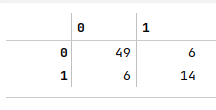
The next step is to display the confusion matrix for the model performance as shown below:
confusion_matrix(y_test, y_predict)
The following illustration displays the confusion matrix for the model performance:
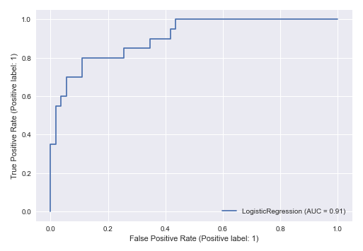
The final step is to display the ROC curve for the model performance as shown below:
RocCurveDisplay.from_estimator(model, s_X_test_f, y_test)
plt.show()
The following illustration displays the ROC curve for the model performance:
Hands-on Demo
The following is the link to the Jupyter Notebook that provides an hands-on demo for this article:
References