Figure.1
| PolarSPARC |
Introduction to Matplotlib - Part 1
| Bhaskar S | 09/17/2017 |
Overview
Matplotlib is a popular 2-dimensional plotting library that is extensively used for data visualization in Python.
Installation and Setup
To make it easy and simple, we choose the open-source Anaconda Python distribution, which includes all the necessary Python packages for science, math, & engineering computations as well as statistical data analysis.
Download and install the Python 3 version of the Anaconda distribution.
Hands-on Matplotlib
We will be using the Jupyter Notebook (previously referred to as the IPython Notebook) environment to experiment with Matplotlib.
Let /home/abc/ipynb be the directory where we want to save all our work with the Jupyter Notebook environment.
Open a terminal and ensure we are in the directory /home/abc/ipynb.
To start the Jupyter Notebook environment, execute the following command:
jupyter notebook
This will launch a web browser as shown in Figure.1 below:
Execute the following magic command to enable embedding of graphical plots in the Jupyter Notebook:
%matplotlib inline
The above magic command enables the plots to be displayed inline below the code cell that produces it.
Import the modules matplotlib.pyplot and numpy as shown below:
import matplotlib.pyplot as plt
import numpy as np
Let us create a set of 5 values for the independent variable x representing subjects and the dependent variable y representing grades as shown below:
x = np.array([1, 2, 3, 4, 5])
y = np.array([92, 89, 91, 76, 96])
To plot the x and y values, use the plot() method as shown below:
plt.plot(x, y)
plt.show()
The plot should look similar to the one shown in Figure.2 below:
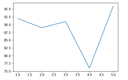
The plot() method by default generates a simple line graph. It is called with two parameters, both of type array (or list). The first parameter represents the x-axis values, while the second parameter represents the y-axis values.
As is evident from the graph in Figure.2 above, there is no title or axes labels. Let us fix that.
To plot the x and y values, along with a title and the axes labels, execute the following methods as shown below:
plt.plot(x, y)
plt.title('Simple Plot (Subjext vs Grade)')
plt.xlabel('Subjects')
plt.ylabel('Grades')
plt.show()
The plot should look similar to the one shown in Figure.3 below:
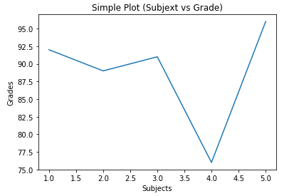
The title() method takes a string as an argument and displays it as the graph title.
The xlabel() method takes a string as an argument and displays it as the label for the x-axis.
The ylabel() method takes a string as an argument and displays it as the label for the y-axis.
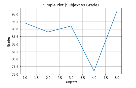
To display the axes grids as in a graph paper, use the grid() method as shown below:
plt.plot(x, y)
plt.title('Simple Plot (Subjext vs Grade)')
plt.xlabel('Subjects')
plt.ylabel('Grades')
plt.grid()
plt.show()
The plot should look similar to the one shown in Figure.4 below:
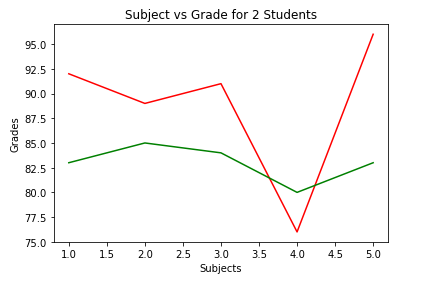
Until now we have been dsplaying grades for one student. We will now plot the grades for two students in different colors.
To display grades for two students in colors red and green, execute the following methods as shown below:
y2 = np.array([83, 85, 84, 80, 83])
plt.plot(x, y, color='r')
plt.plot(x, y2, color='g')
plt.title('Subject vs Grade for 2 Students')
plt.xlabel('Subjects')
plt.ylabel('Grades')
plt.show()
The plot should look similar to the one shown in Figure.5 below:
To indicate a color for a graph line, specify the color parameter in the plot() method. One can specify any of the following predefined one-letter code for the color parameter:
| Code | Color |
|---|---|
| b | Blue |
| c | Cyan |
| g | Green |
| k | Black |
| m | Magenta |
| r | Red |
| y | Yellow |
To change the limits (minimum and maximum values) along the x-axis and y-axis, execute the following methods as shown below:
plt.plot(x, y, color='r')
plt.plot(x, y2, color='g')
plt.title('Subject vs Grade for 2 Students')
plt.xlabel('Subjects')
plt.ylabel('Grades')
plt.xlim(xmin=1, xmax=5)
plt.ylim(ymin=60, ymax=100)
plt.show()
The plot should look similar to the one shown in Figure.6 below:
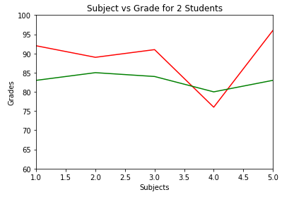
The xlim() method takes two parameters - xmin for the minimum value along the x-axis and xmax for the maximum value along the x-axis.
Similarly, the ylim() method takes two parameters - ymin for the minimum value along the y-axis and ymax for the maximum value along the y-axis.
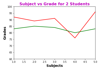
In addition to the color of a graph line, one can indicate the thickness of the graph line. Also, one can control the color and font characteristics of the text used to display the title and axes labels.
To change the thickness of the graph lines as well as change the display characteristics of the title and axes labels, execute the following methods as shown below:
plt.plot(x, y, color='r', linewidth=2)
plt.plot(x, y2, color='g', linewidth=2)
plt.title('Subject vs Grade for 2 Students', color='m', fontsize='16', fontweight='bold')
plt.xlabel('Subjects', fontsize='14', fontweight='bold')
plt.ylabel('Grades', fontsize='14', fontweight='bold')
plt.xlim(xmin=1, xmax=5)
plt.ylim(ymin=60, ymax=100)
plt.show()
The plot should look similar to the one shown in Figure.7 below:
Instead of the vague numbers (representing subjects) along the x-axis, we would like to display names of the subjects. To do that, execute the following methods as shown below:
plt.plot(x, y, color='r', linewidth=2)
plt.plot(x, y2, color='g', linewidth=2)
plt.title('Subject vs Grade for 2 Students', color='m', fontsize='16', fontweight='bold')
plt.xlabel('Subjects', fontsize='14', fontweight='bold')
plt.ylabel('Grades', fontsize='14', fontweight='bold')
plt.xlim(xmin=1, xmax=5)
plt.ylim(ymin=60, ymax=100)
subjects = ['Biology', 'Chemistry', 'English', 'Math', 'Physics']
plt.xticks(x, subjects)
plt.yticks(range(60, 100, 5))
plt.show()
The plot should look similar to the one shown in Figure.8 below:
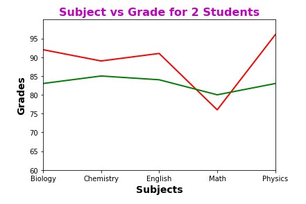
The xticks() method takes two parameters - an array (or list) of positions along the x-axis and an array (or list) of corresponding textual labels. If the second parameter is not specified, then the values from the first parameter are used as labels for positions along the x-axis.
Similarly, the yticks() method takes two parameters - an array (or list) of positions along the y-axis and an array (or list) of corresponding textual labels. If the second parameter is not specified, then the values from the first parameter are used as labels for positions along the y-axis.
By default, the xticks() (or yticks()) method displays the labels horizontally (as seen from Figure.8 above). To change the angle of the displayed labels to 45°, specify the rotation as shown below:
plt.plot(x, y, color='r', linewidth=2)
plt.plot(x, y2, color='g', linewidth=2)
plt.title('Subject vs Grade for 2 Students', color='m', fontsize='16', fontweight='bold')
plt.xlabel('Subjects', fontsize='14', fontweight='bold')
plt.ylabel('Grades', fontsize='14', fontweight='bold')
plt.xlim(xmin=1, xmax=5)
plt.ylim(ymin=60, ymax=100)
subjects = ['Biology', 'Chemistry', 'English', 'Math', 'Physics']
plt.xticks(x, subjects, rotation=45)
plt.yticks(range(60, 100, 5))
plt.show()
The plot should look similar to the one shown in Figure.9 below:
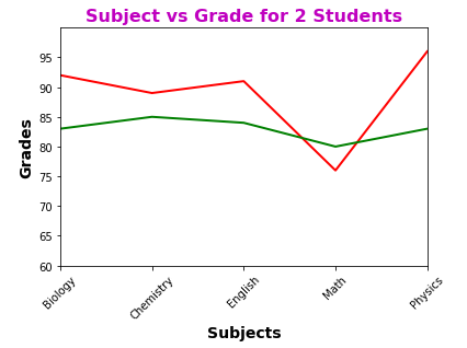
The rotation parameter takes numerical value to indicate the angle of display. A value of 90 indicates vertical.
By default, the plotted line graph is a solid line. To change how the line is displayed, specify the linestyle parameter in the plot() method. To display a dotted for the grades of one student and a dashed line for grades of another student, execute the following methods as shown below:
plt.plot(x, y, color='r', linewidth=2, linestyle=':')
plt.plot(x, y2, color='g', linewidth=2, linestyle='--')
plt.title('Subject vs Grade for 2 Students', color='m', fontsize='16', fontweight='bold')
plt.xlabel('Subjects', fontsize='14', fontweight='bold')
plt.ylabel('Grades', fontsize='14', fontweight='bold')
plt.xlim(xmin=1, xmax=5)
plt.ylim(ymin=60, ymax=100)
subjects = ['Biology', 'Chemistry', 'English', 'Math', 'Physics']
plt.xticks(x, subjects, rotation=45)
plt.yticks(range(60, 100, 5))
plt.show()
The plot should look similar to the one shown in Figure.10 below:
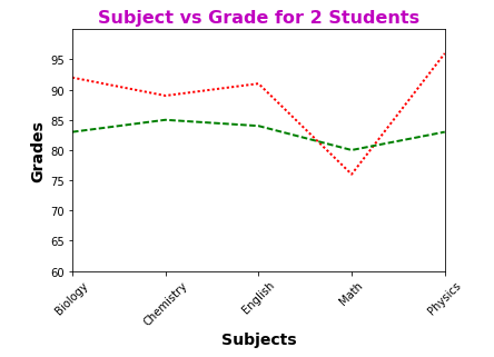
One can specify any of the following predefined codes for the linestyle parameter:
| Code | Line Style |
|---|---|
| - | Solid |
| -- | Dashed |
| : | Dotted |
| -. | Dash & Dot |
By default, the plot() method does not display any markers at the specified data points (x and y values). To display a small circle for the grades of one student and a diamond for grades of another student, execute the following methods as shown below:
plt.plot(x, y, color='r', linewidth=2, linestyle=':', marker='o')
plt.plot(x, y2, color='g', linewidth=2, linestyle='--', marker='D')
plt.title('Subject vs Grade for 2 Students', color='m', fontsize='16', fontweight='bold')
plt.xlabel('Subjects', fontsize='14', fontweight='bold')
plt.ylabel('Grades', fontsize='14', fontweight='bold')
plt.xlim(xmin=1, xmax=5)
plt.ylim(ymin=60, ymax=100)
subjects = ['Biology', 'Chemistry', 'English', 'Math', 'Physics']
plt.xticks(x, subjects, rotation=45)
plt.yticks(range(60, 100, 5))
plt.show()
The plot should look similar to the one shown in Figure.11 below:
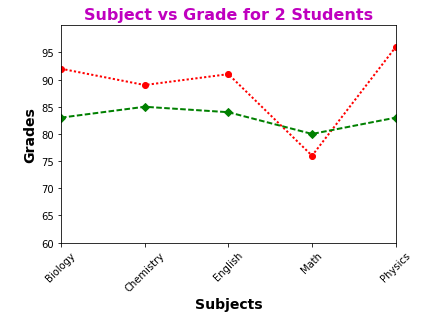
One can specify any of the following predefined codes for the marker parameter:
| Code | Marker Type |
|---|---|
| d | Diamond |
| h | Hexagon |
| o | Circle |
| p | Pentagon |
| s | Square |
| v | Triangle |
| * | Star |
| + | Plus |
| x | Cross |
To display a legend on what each line represents, execute the following methods as shown below:
plt.plot(x, y, color='r', linewidth=2, linestyle=':', marker='o', label='Alice')
plt.plot(x, y2, color='g', linewidth=2, linestyle='--', marker='d', label='Bob')
plt.title('Subject vs Grade for 2 Students', color='m', fontsize='16', fontweight='bold')
plt.xlabel('Subjects', fontsize='14', fontweight='bold')
plt.ylabel('Grades', fontsize='14', fontweight='bold')
plt.xlim(xmin=1, xmax=5)
plt.ylim(ymin=60, ymax=100)
subjects = ['Biology', 'Chemistry', 'English', 'Math', 'Physics']
plt.xticks(x, subjects, rotation=45)
plt.yticks(range(60, 100, 5))
plt.legend(loc=4)
plt.show()
The plot should look similar to the one shown in Figure.12 below:
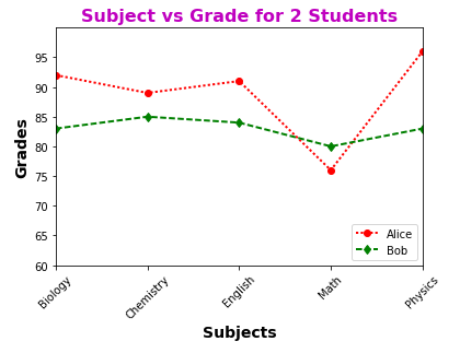
To associate a legend with each graph line, specify the label parameter in the plot() method. In addition, in order to display the legend, execute the legend() method. One can specify a location where the legend will be displayed on the graph by choosing any of the following predefined values for the loc parameter:
| Code | Location |
|---|---|
| 0 | Auto |
| 1 | Upper Right |
| 2 | Upper Left |
| 3 | Lower Left |
| 4 | Lower Right |
References